Cambio Design System
A personal project where I practiced building a design system with foundations and reusable components
View Complete Documentation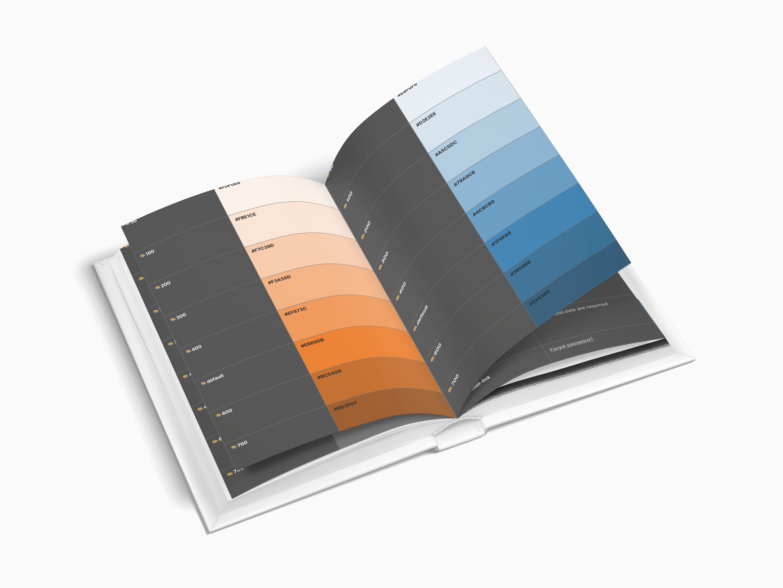
A personal project where I practiced building a design system with foundations and reusable components
View Complete Documentation
I created a design system for the Cambio app redesign to practice building consistent foundations and reusable components.
Analyze existing screens to identify repeated elements, inconsistencies, and patterns across the application.
Establish design tokens for typography, colors, spacing, and iconography to ensure consistency.
Transform patterns into reusable components with comprehensive documentation and accessibility specs.
This design system demonstrates core foundations that establish visual consistency and scalability across all components.
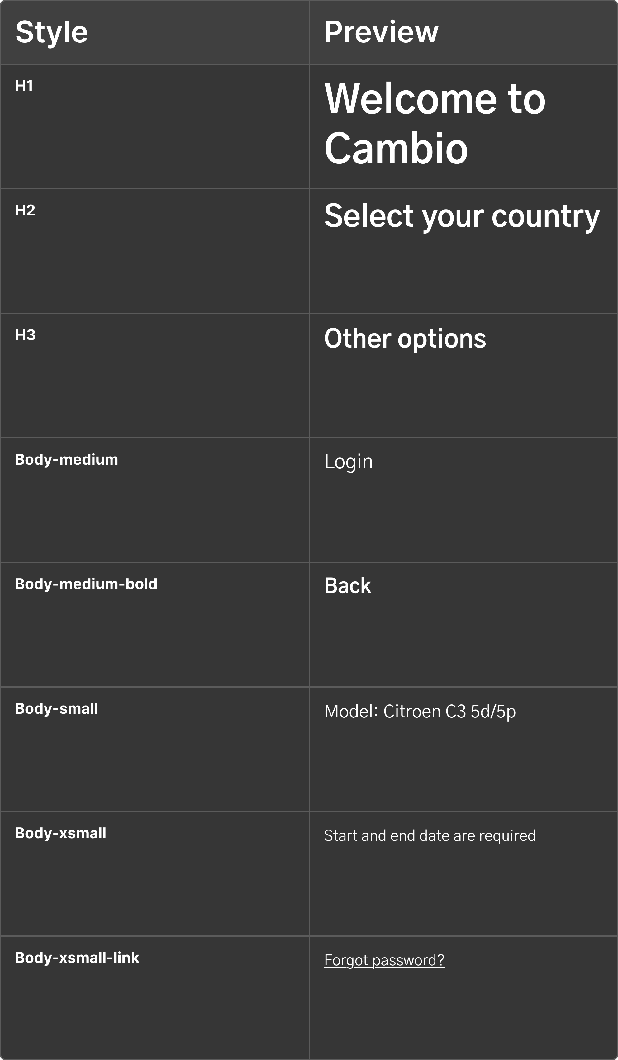
A clear hierarchy with 9 text styles, from hero titles (32px/Bold) to helper text (12px/Regular). Each style serves a specific purpose, creating rhythm and improving readability.
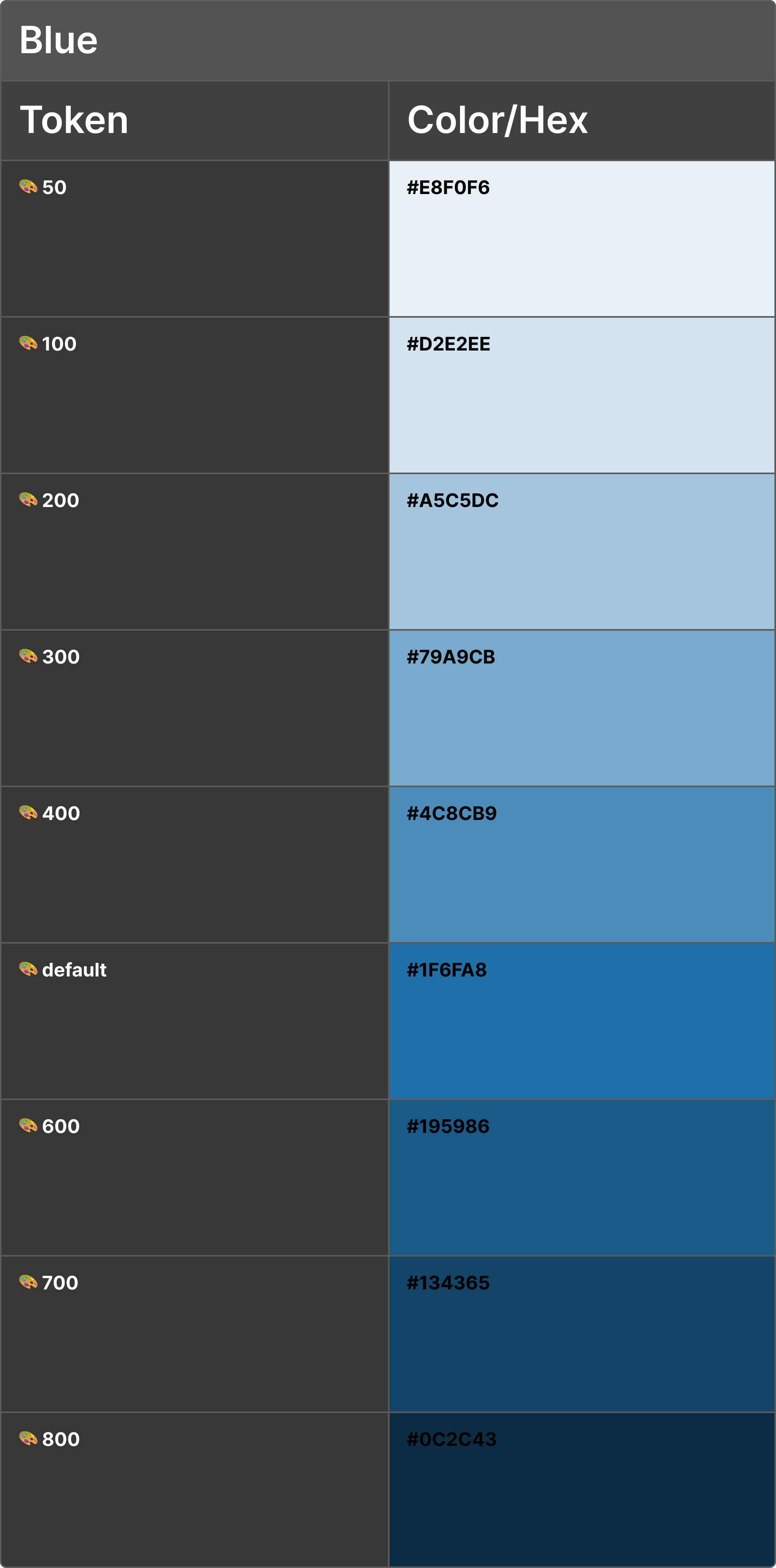
The main brand color with full tonal range (50-800) used for primary actions, navigation elements, and brand-defining UI components.
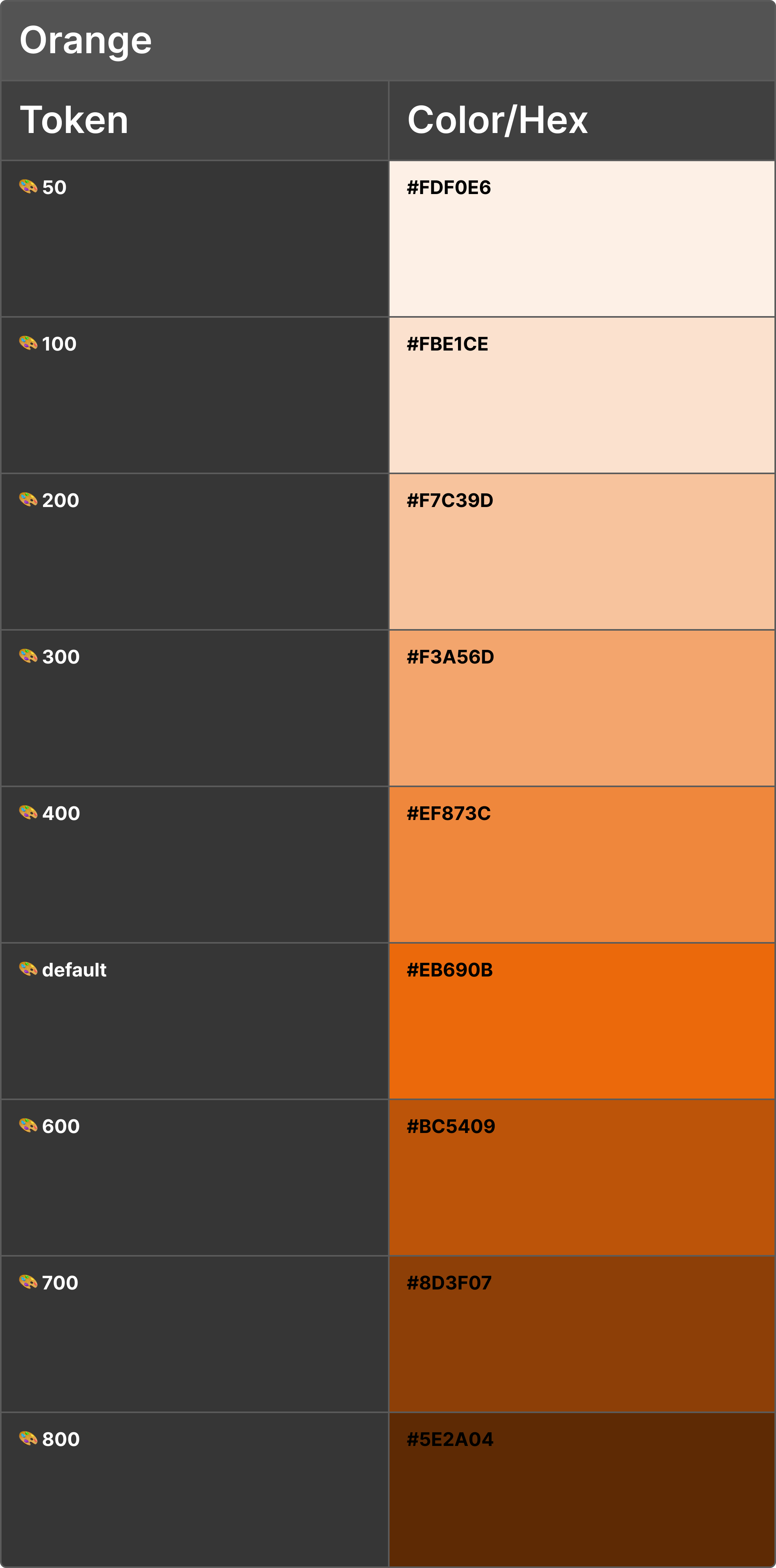
Accent brand color with full tonal range (50-800) used for highlights, secondary actions, and complementary brand elements.
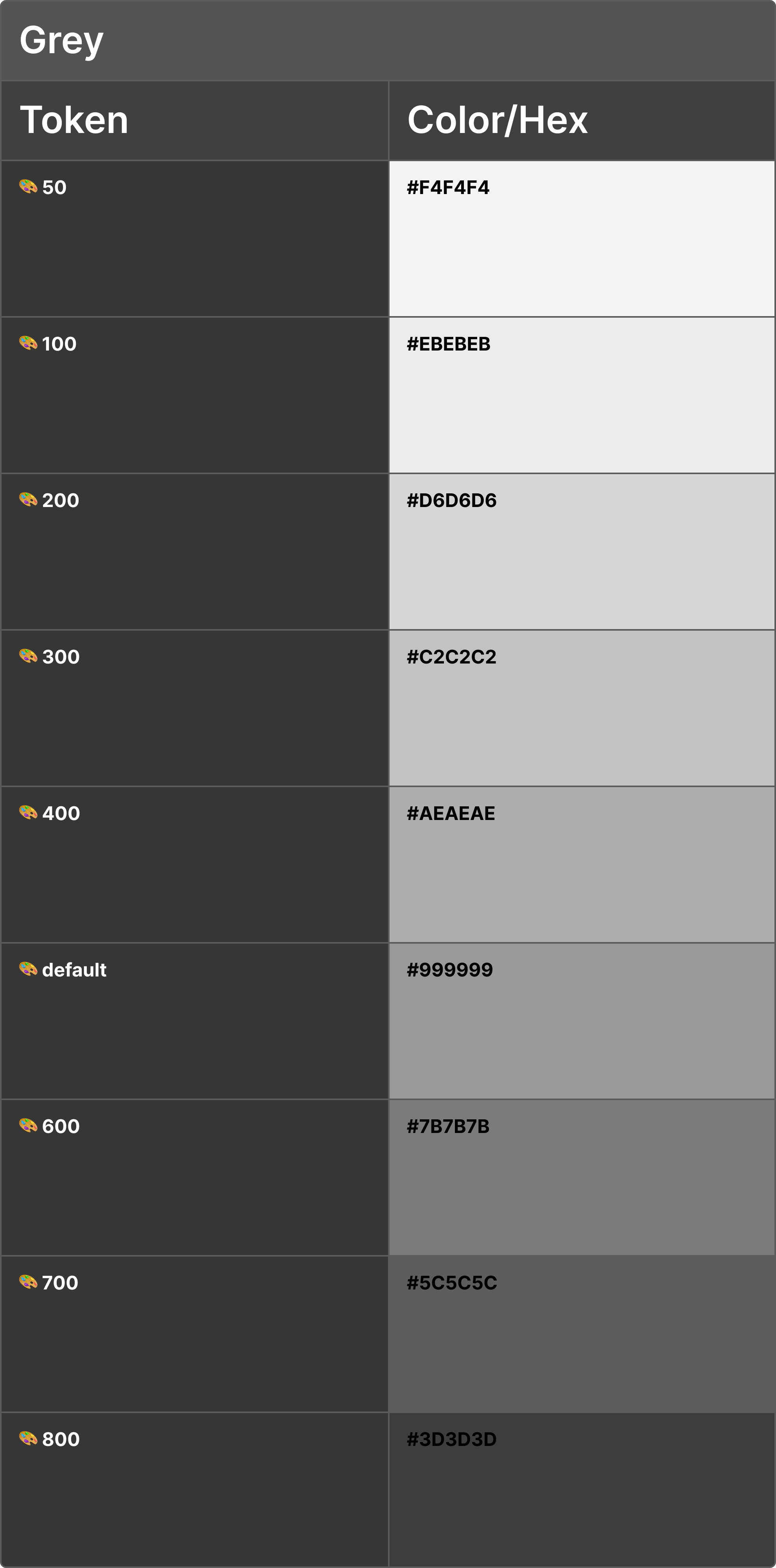
Gray scale palette used for backgrounds, text, borders, surfaces, and disabled states. These support structure and hierarchy.
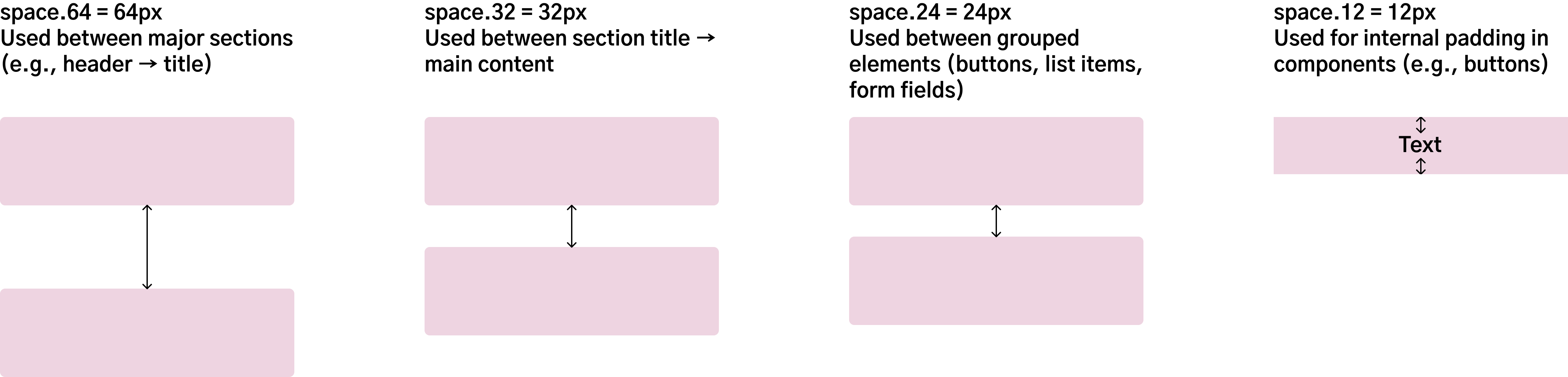
Four fixed tokens (12px, 24px, 32px, 64px) ensure consistent padding, margins, and alignment. These values create visual balance and predictability across all screens.
Examples of reusable, documented components covering primary use cases. Each includes specs, variants, and accessibility guidelines.
Primary action buttons with 4 variants (Default, Outline, Secondary, Disabled). All share the same size, radius (30px), and typography (Body-medium-bold).


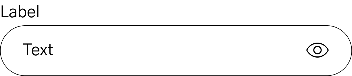
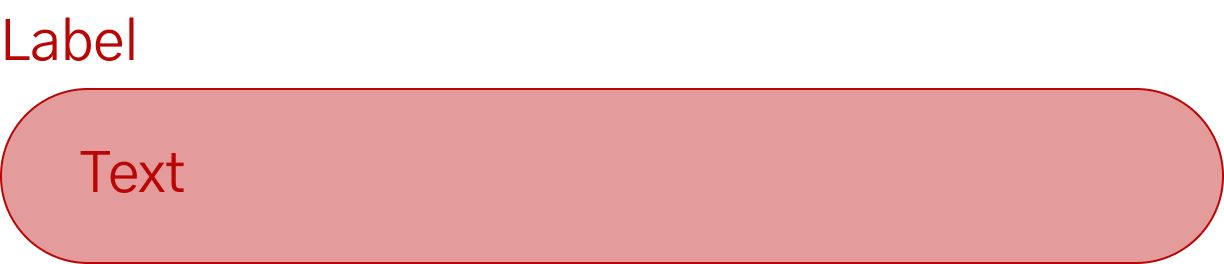
Input fields with 3 states (Default, Active, Error). Includes helper text, icons, and accessibility-compliant touch targets (44x44px minimum).

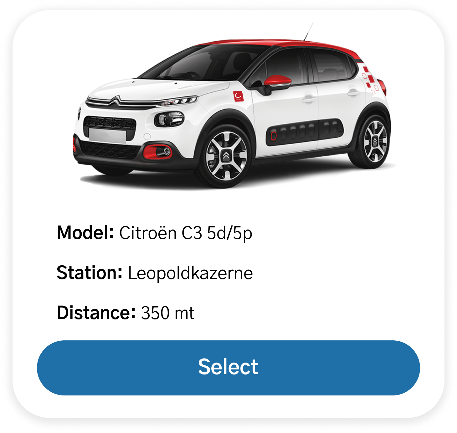
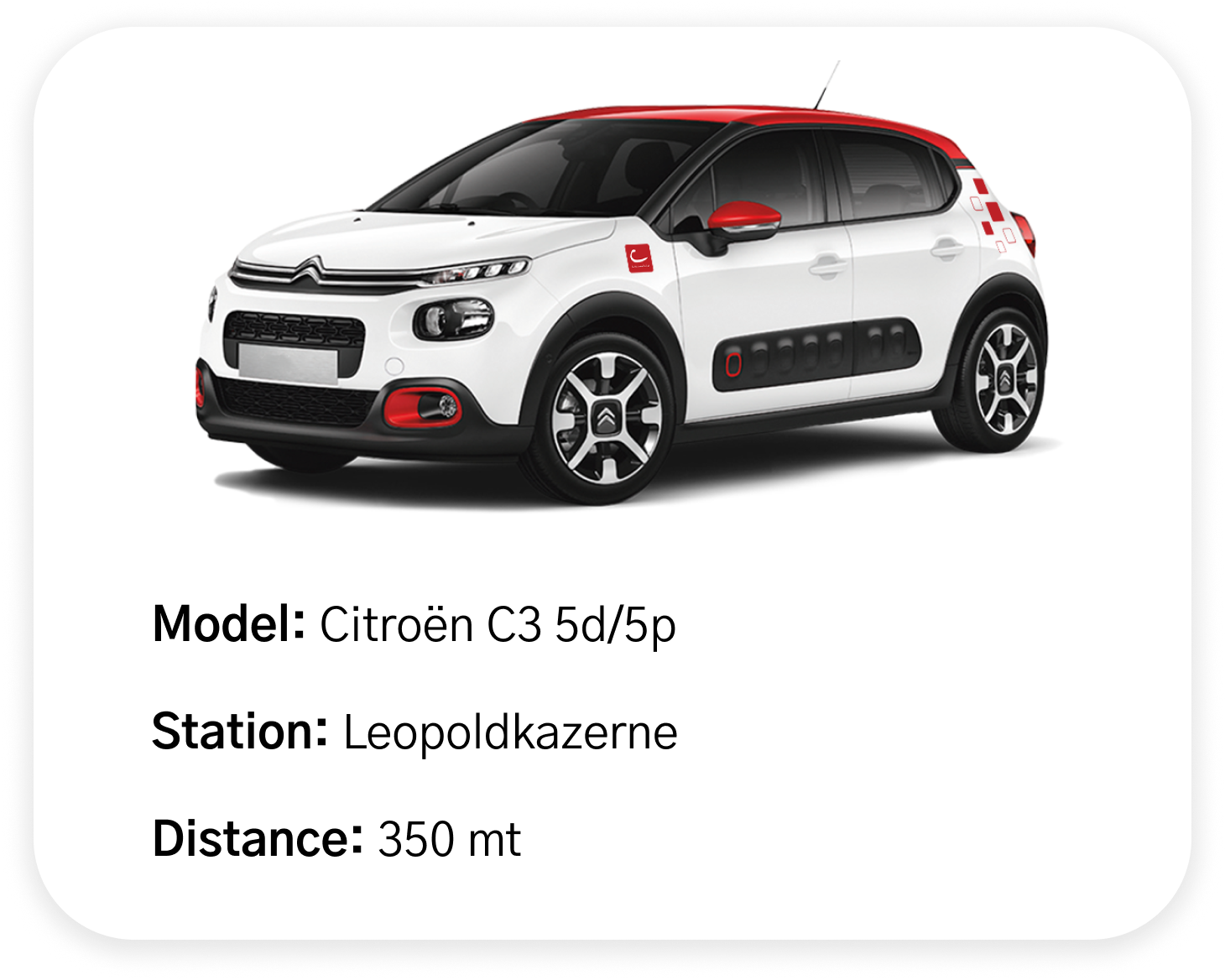
Two variants: with and without action buttons. Used in the "Available cars" list and reservation summaries to display vehicle information in a scannable format.
For developer handoff, I would include: