Cambio Autodelen App Redesign
From accessibility issues to business impact: transforming the registration experience to protect market share in Belgium's competitive car-sharing landscape
View Interactive Prototype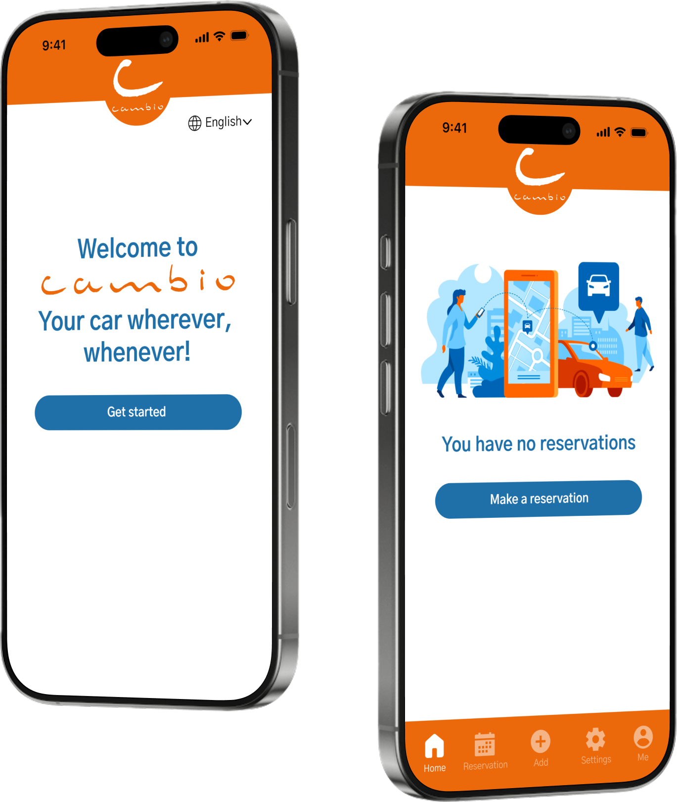
From accessibility issues to business impact: transforming the registration experience to protect market share in Belgium's competitive car-sharing landscape
View Interactive Prototype
I analyzed the Cambio Autodelen app and found significant usability problems that could drive users to competitors.
The existing interface suffered from accessibility issues, including inadequate touch targets, unclear visual hierarchy, and weak brand identity. The registration process was particularly problematic, causing user frustration and potential drop-offs.
Simplify the sign-up process to reduce friction and drop-off rates, making it faster and easier for new users to join Cambio
Create a consistent, recognizable visual identity throughout the app that reinforces Cambio's market position
Address touch target sizes, visual hierarchy, and other accessibility issues to ensure the app works for all users
Provide multiple language options for Belgium's multilingual market, enabling faster, more comfortable registration
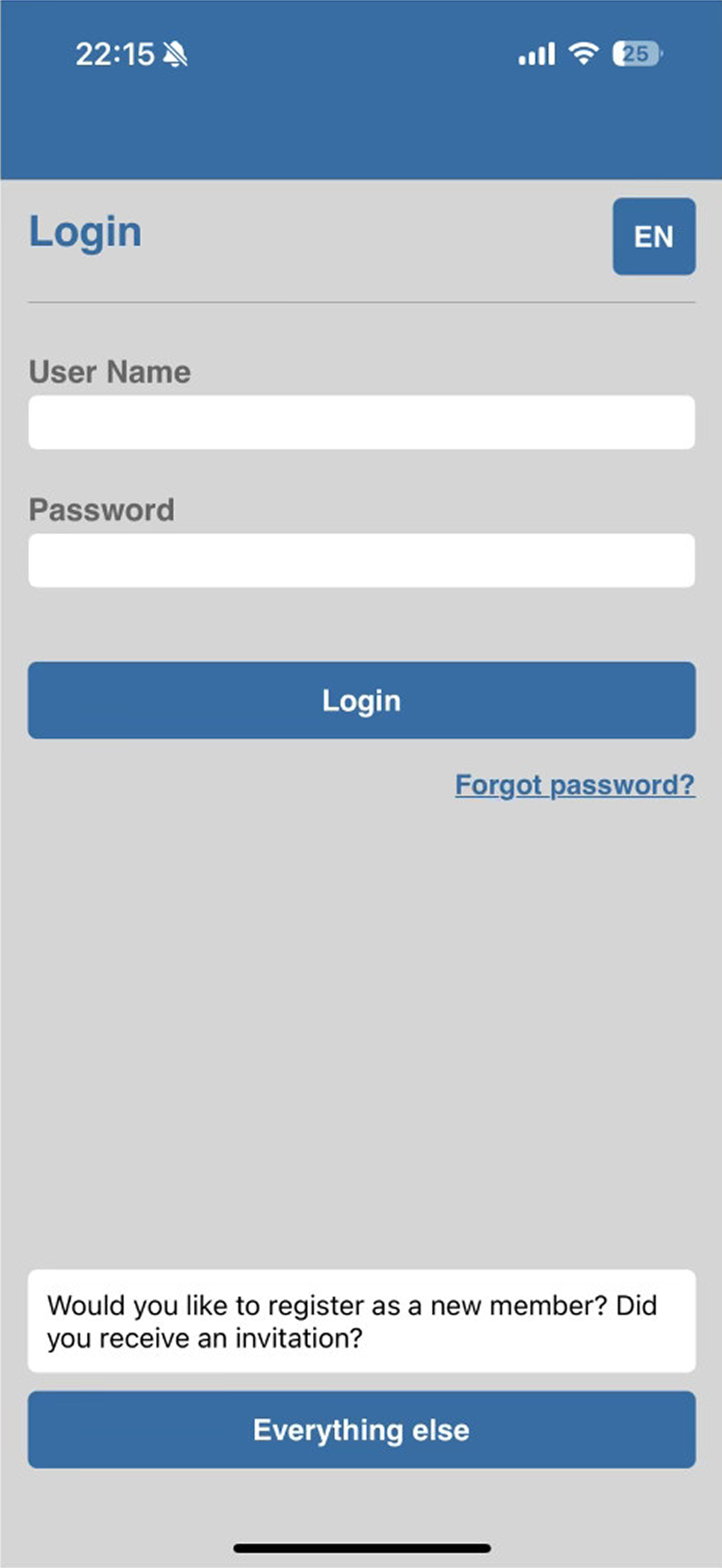
Touch targets fell below the recommended 44x44pt minimum, making it difficult for users to accurately tap buttons and form fields—especially problematic for users with motor impairments or those using the app while on the move.
The absence of clear visual hierarchy left users confused about where to focus their attention. Inconsistent spacing and typography created a cluttered, unprofessional appearance that reduced user confidence in the service.
The app's visual identity didn't reflect Cambio's brand values or differentiate it from competitors. Generic styling and lack of brand colors made the experience feel disconnected from the Cambio brand users knew from marketing materials, reducing brand recognition and trust.
The sign-up process required too many steps with unclear instructions, leading to user frustration and abandoned registrations. Users reported confusion about required information, creating a significant barrier to customer acquisition.
In Belgium's multilingual market (Dutch, French, English), forcing users to navigate registration in a single language increased cognitive load and error rates, particularly for non-native speakers.
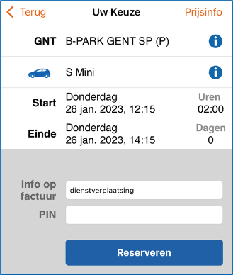
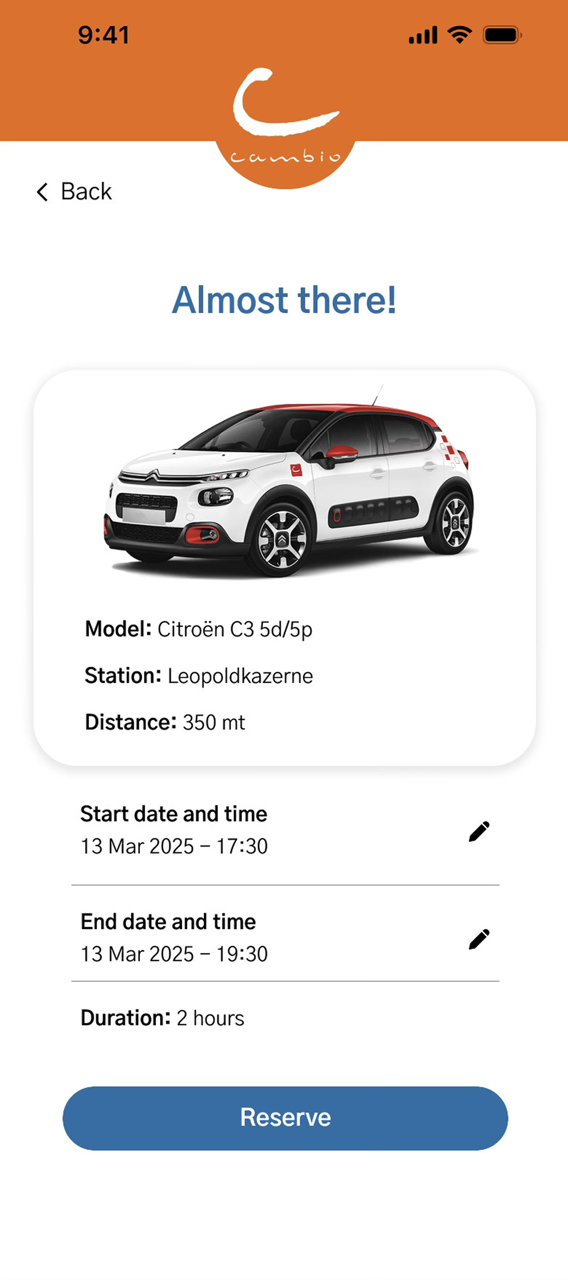
The comparison below illustrates the transformation from the problematic current design to the improved proposed solution.
The redesign phase focused on addressing the issues uncovered during user research with targeted, user-centered solutions.
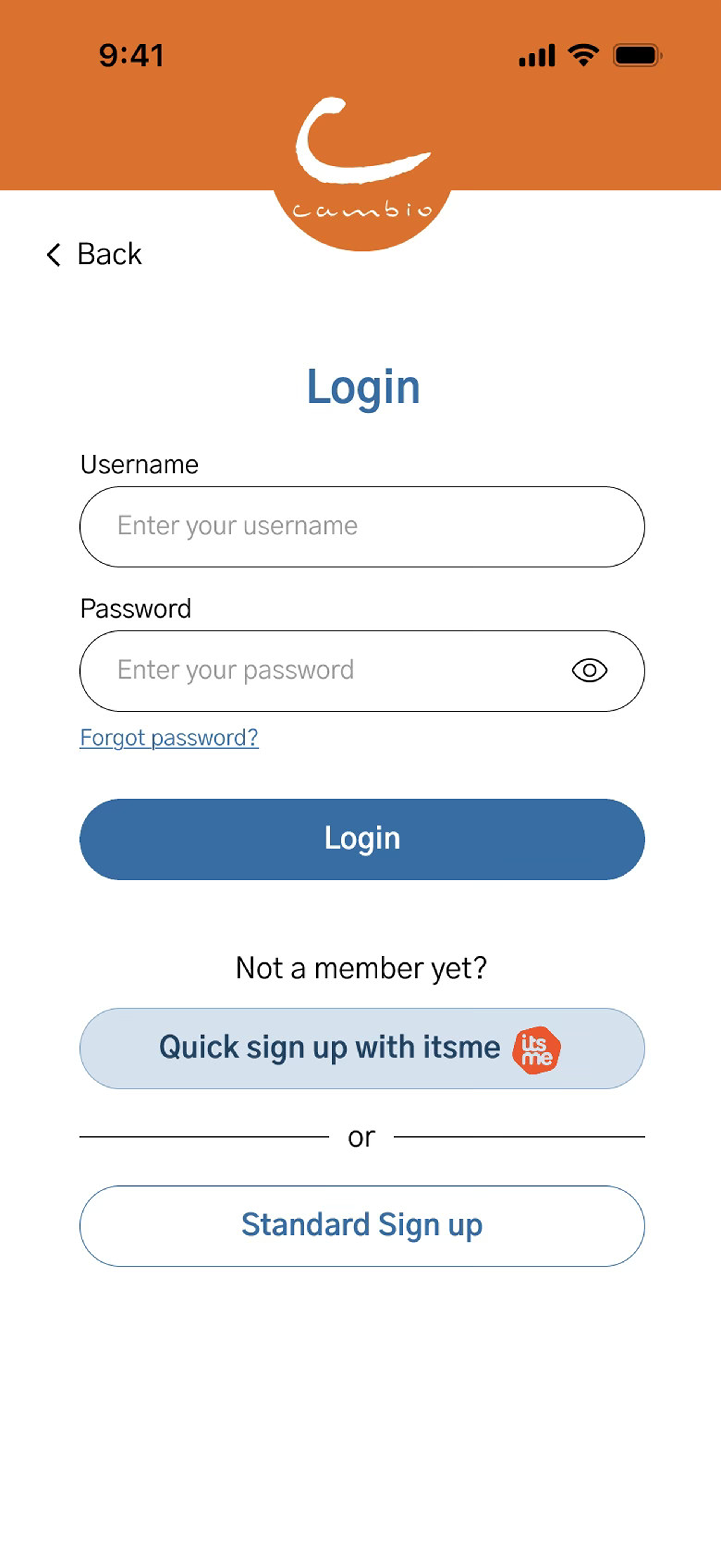
Registration time reduced from several minutes to under 30 seconds — eliminating lengthy forms and ensuring verified identity.
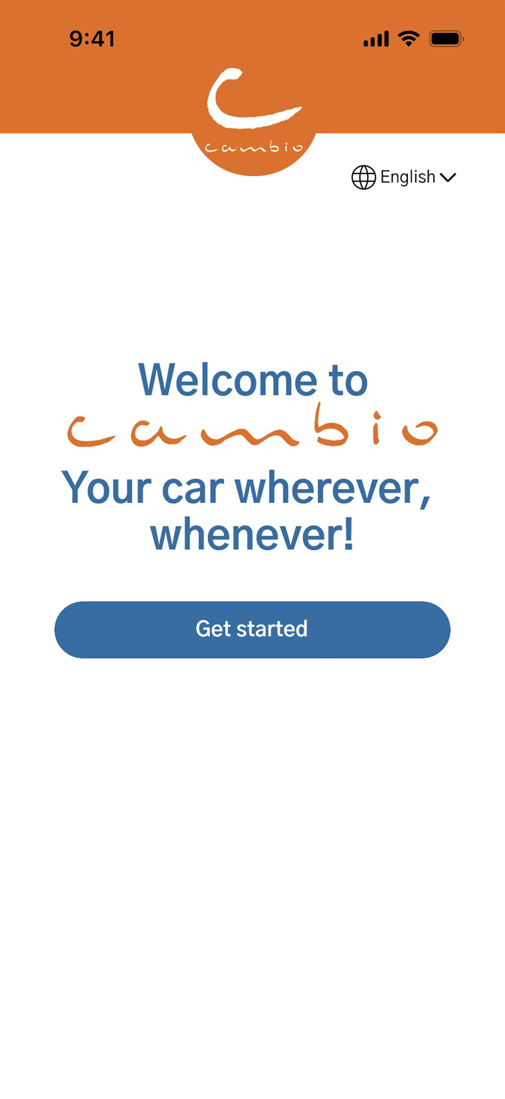
Consistent brand presence throughout — introducing Cambio's colors, typography, and visual style.
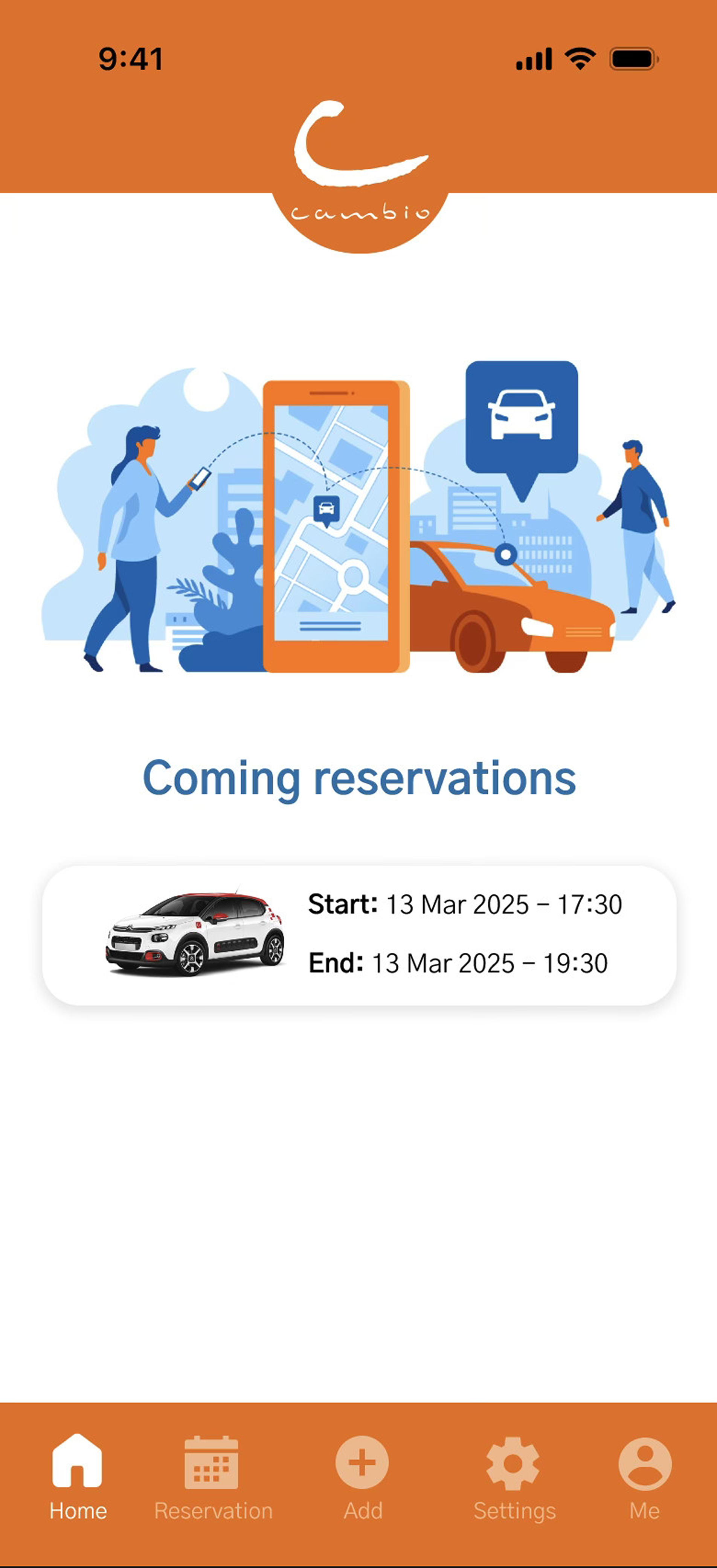
Clear, scannable reservation details — providing all essential information at a glance with improved visual hierarchy.
WCAG 2.1 AA compliant throughout — ensuring accessibility for all users regardless of ability.
Every interaction rewritten for clarity — replacing ambiguous phrases with action-oriented language.
The final design brings together refined navigation, simplified sign-up with itsme® integration, and consistent branding to create a seamless, user-focused experience.