← Back to Projects

City of Gent Sports Booking Redesign

Streamlining the booking flow with mobile-first design and accessibility improvements

Role: UX/UI Designer Timeline: Jan 2026 Type: Redesign
View Interactive Prototype
City of Gent Sports Booking Interface

The Challenge

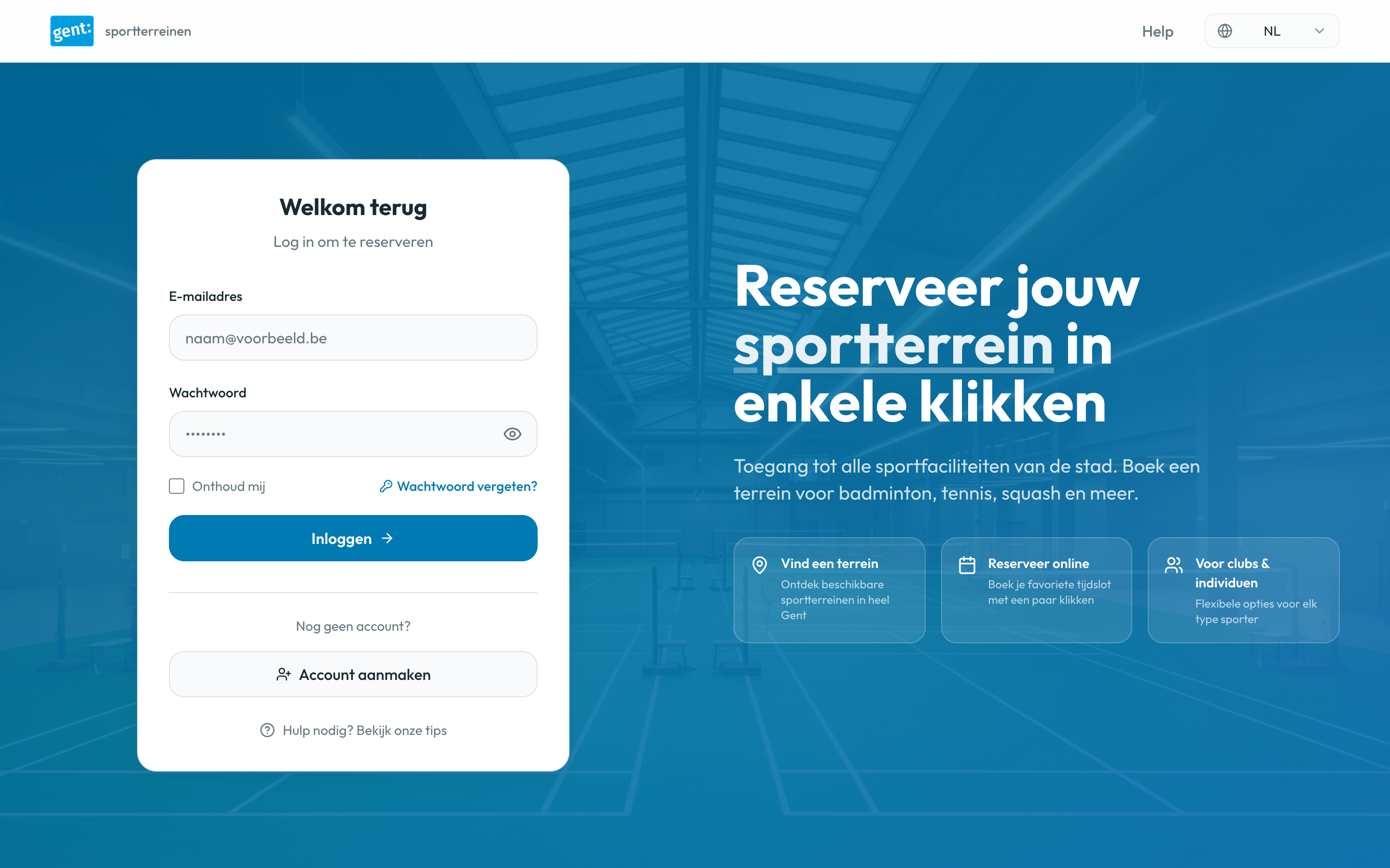
The City of Gent's sports booking platform serves thousands of residents daily, but the current experience presents significant usability challenges. Users face an 8-step booking process with hidden pricing, no mobile optimization, and multiple accessibility barriers.

⚠️ Disclaimer

This is a personal redesign project for portfolio purposes. Not affiliated with the City of Gent.

UX & UI Issues

8-Step Booking Process

Users lose context and abandon the flow due to excessive steps between search and confirmation

Critical UX

Hidden Pricing

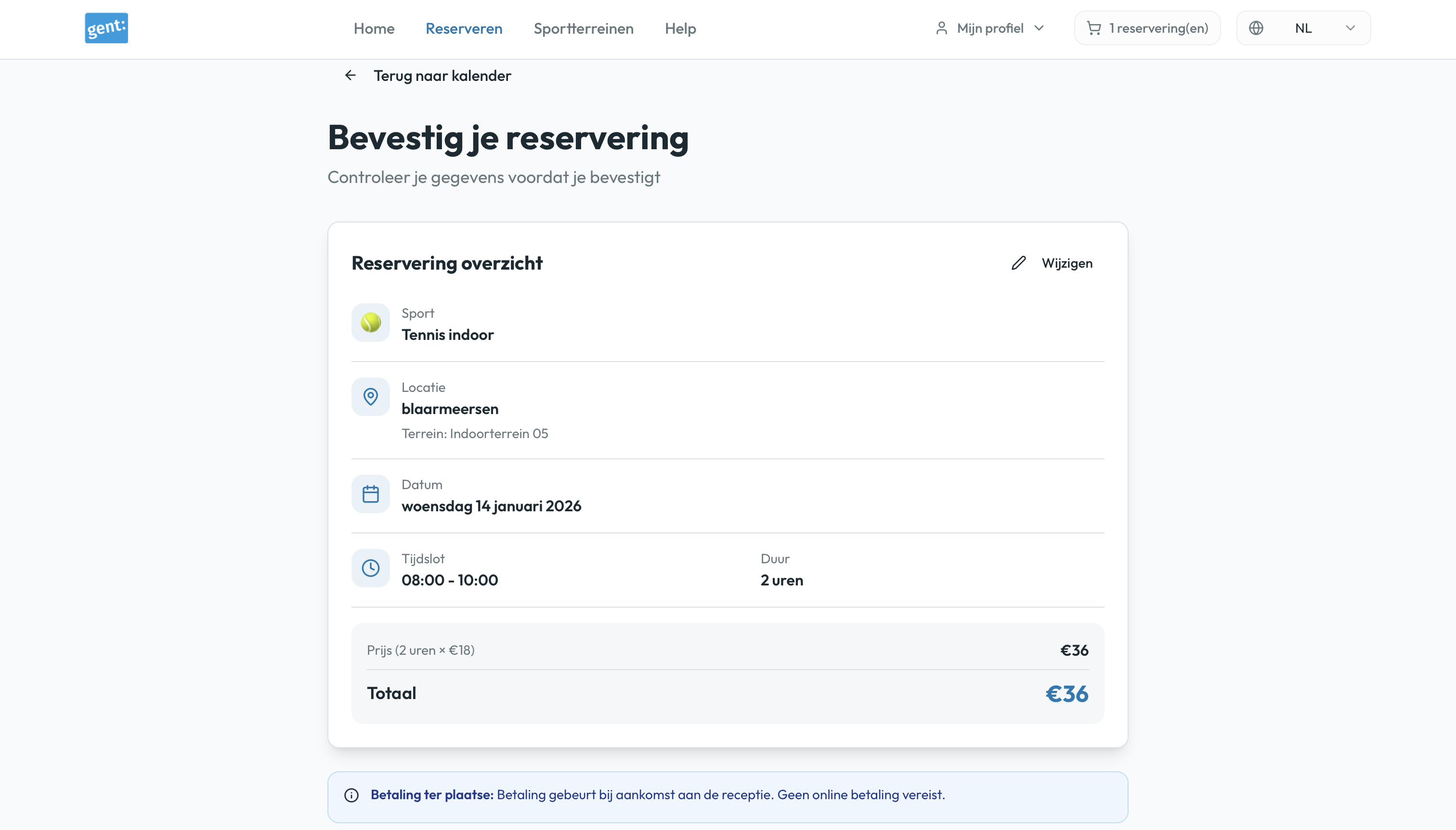
Price not visible until step 7 of 8, creating transparency issues and user frustration

Critical UX

Zero Mobile Optimization

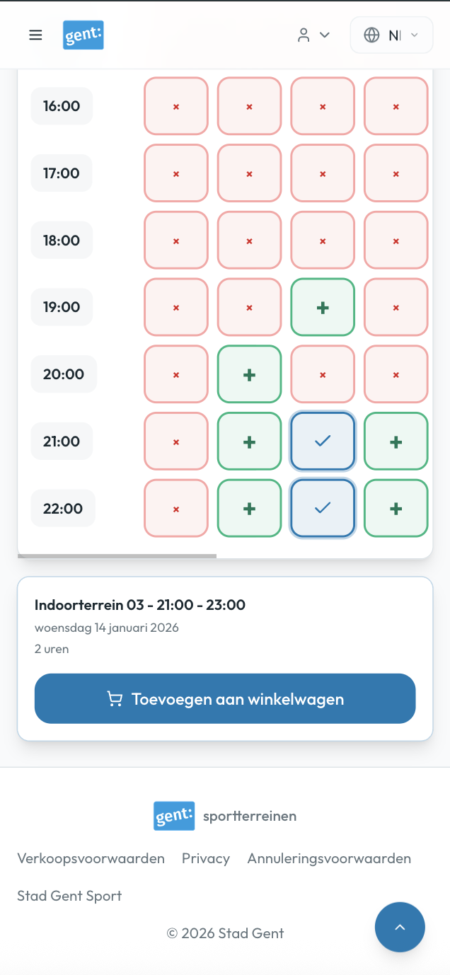
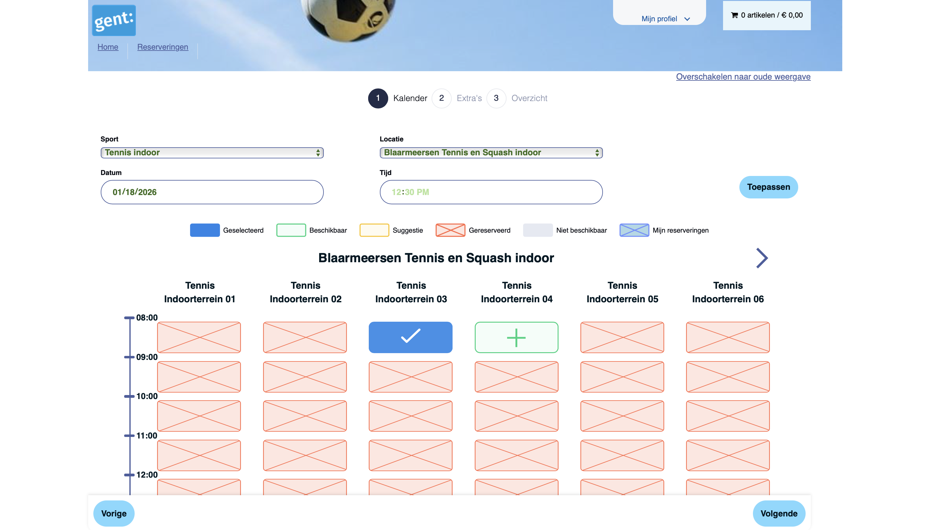
Calendar requires horizontal scrolling, making it completely unusable on mobile devices

Critical Accessibility

Competing Search Methods

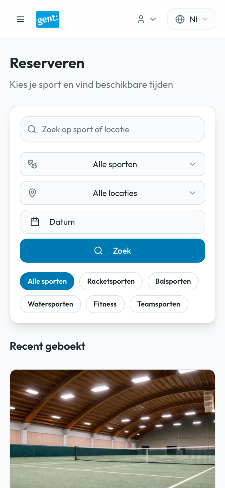
Two different search patterns create confusion and poor visual hierarchy

High UX

Poor Color Contrast

Fails WCAG AA standards, creating barriers for users with visual impairments

High Accessibility

Missing Alt Text

36 instances of images without alt text, creating screen reader barriers

High Accessibility

No Progress Indication

Users don't know their location in the flow or how many steps remain

Medium UX

Visual Inconsistencies

Inconsistent card heights, text wrapping issues, and legend mismatch

Medium Visual Design

Missing Interactive States

No hover or focus states to provide feedback on clickable elements

Medium Visual Design

Small Touch Targets

Clickable elements below minimum size, difficult for motor impairments
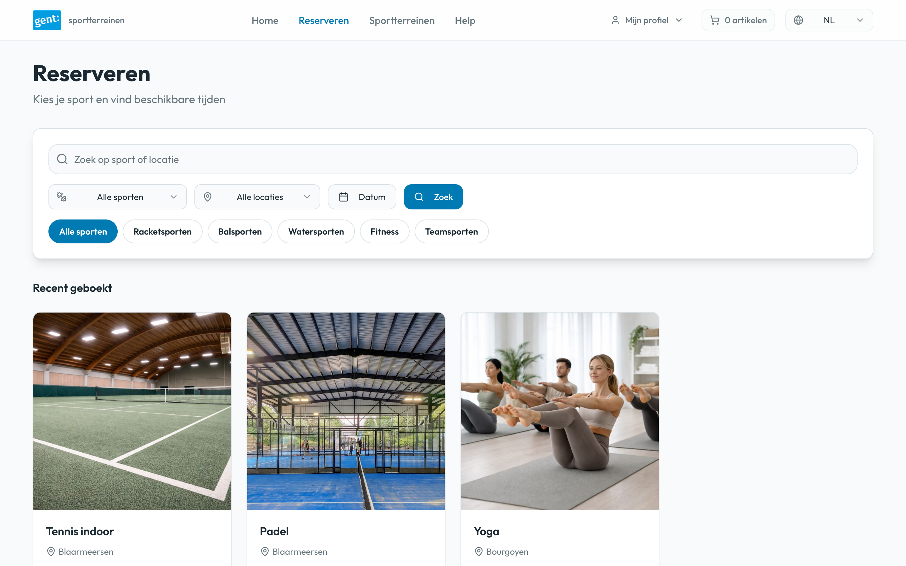
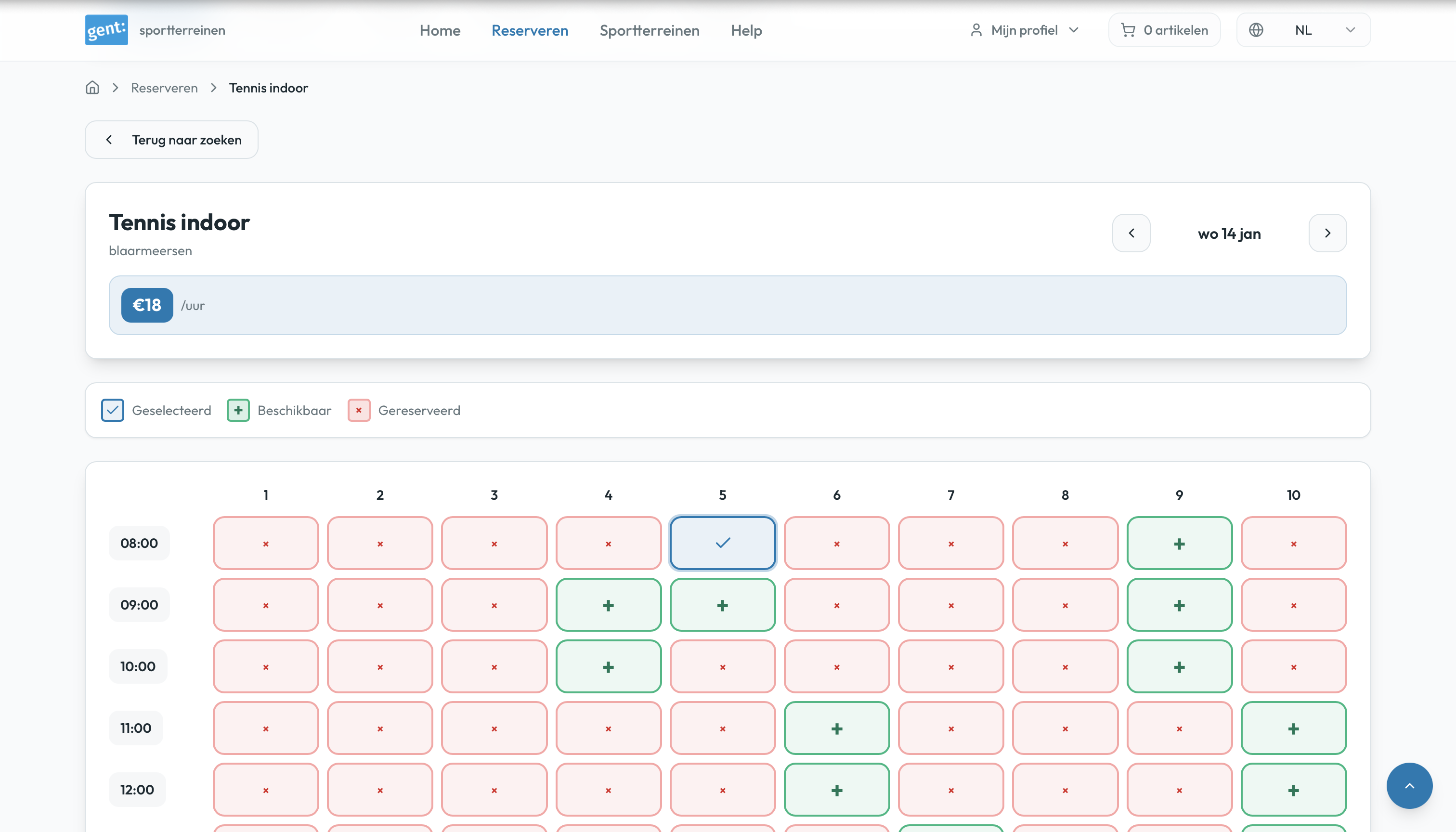
Medium Accessibility

Redesigned Experience

My approach focused on three core principles: simplify the booking flow, prioritize mobile users, and ensure accessibility standards are met throughout.

Streamlined 5-Step Flow

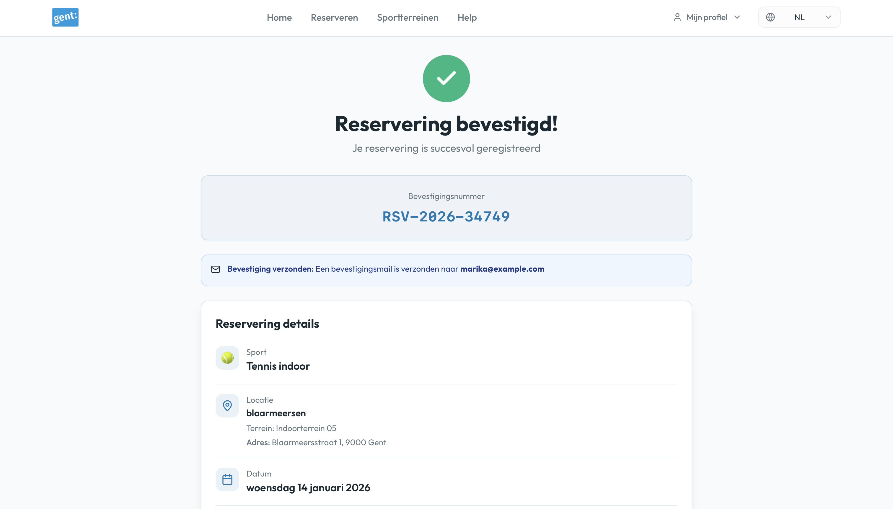
Reduced from 8 to 5 clear steps — eliminating redundant screens and simplifying the booking process.

  • Combined redundant screens (Login → Dashboard → Search → Book → Confirm)
  • Consolidated checkout into single view
  • Added "Recent bookings" for faster repeat reservations
  • Clear progress indication throughout
Simplified dashboard with clear navigation

Transparent Pricing

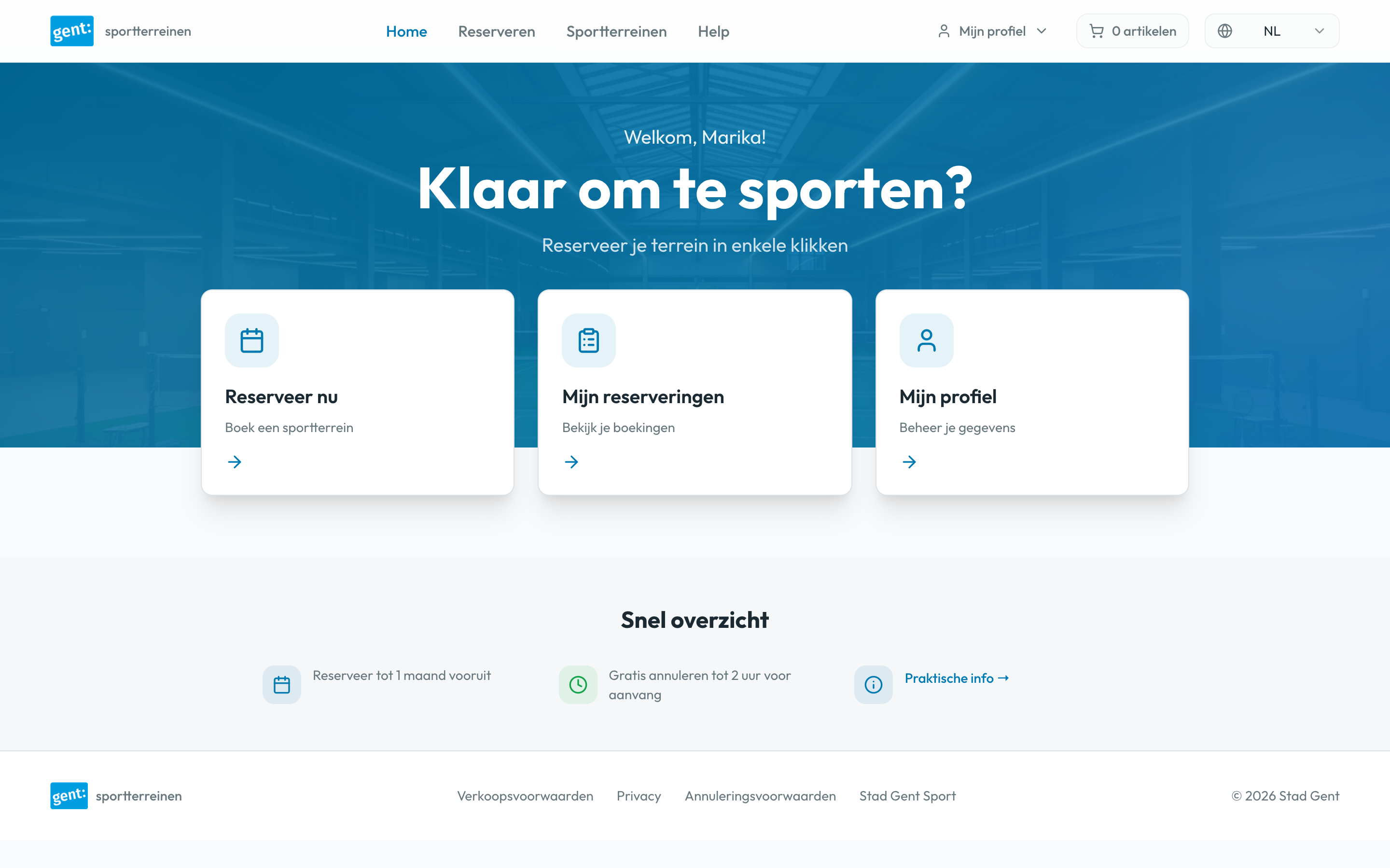
Made pricing visible from the start — allowing users to make informed decisions early in the booking process.

  • Prices visible from search results (step 2)
  • Real-time cost calculation in calendar view
  • Clear breakdown before confirmation
  • No surprises at checkout
Search results showing transparent pricing

Enhanced Calendar Interface

Redesigned calendar with clear visual indicators — adding support for multi-hour consecutive bookings with real-time pricing.
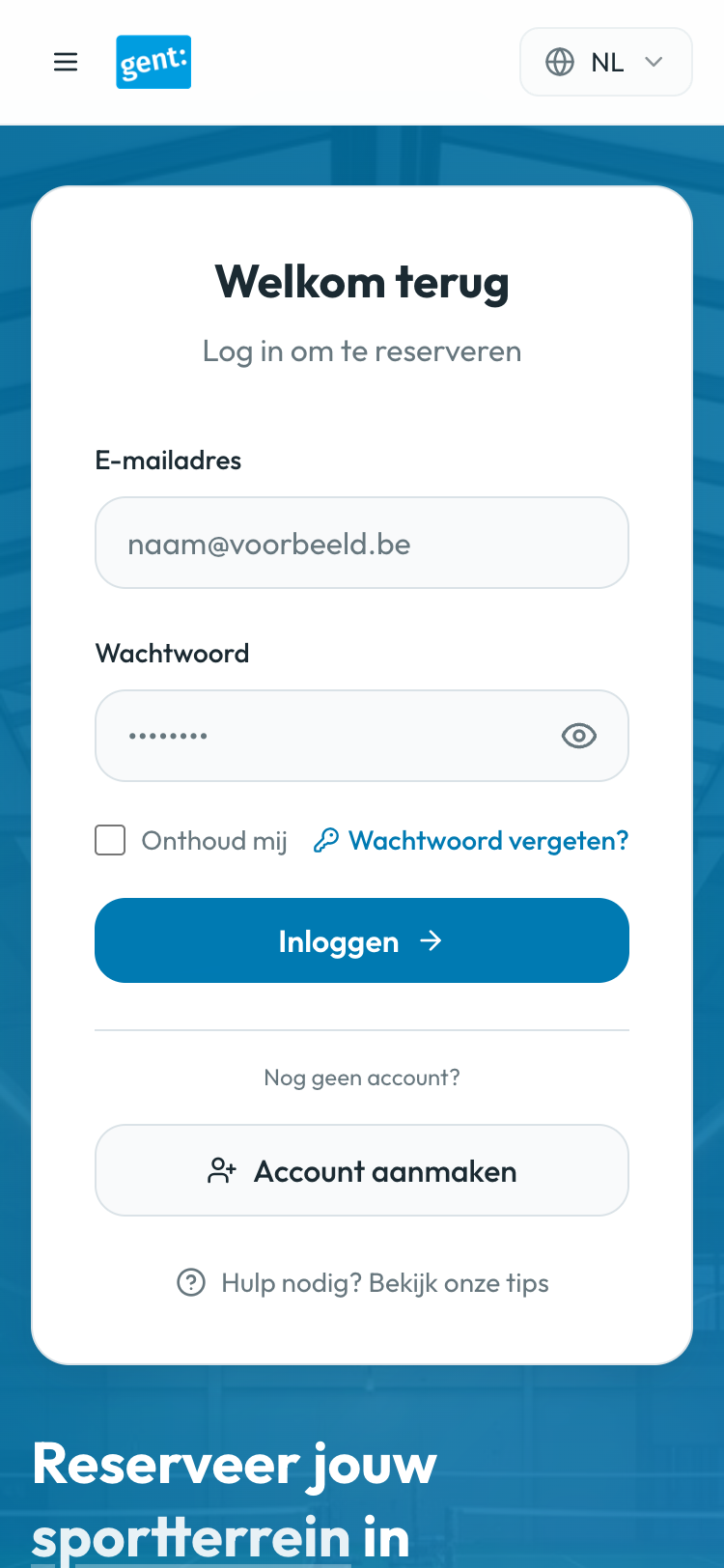
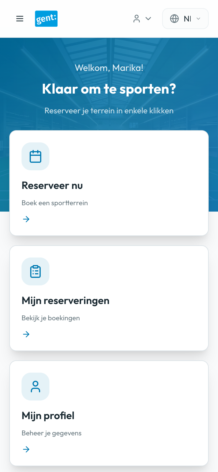
  • Visual clarity: Green (+) for available, red (×) for booked
  • Multi-hour consecutive booking support
  • Matching legend icons with grid symbols
  • Clear time range display (e.g., "08:00 - 10:00")
  • Real-time price updates as slots are selected
Enhanced calendar with clear availability indicators

Mobile-First Design

Built for mobile from the ground up — ensuring a smooth, accessible experience across all devices and screen sizes.

  • Responsive layouts for all screen sizes
  • Touch-friendly targets (min 44×44px)
  • Hamburger navigation for mobile
  • No horizontal scrolling required
  • Optimized for one-handed use
Mobile-optimized dashboard interface

Accessibility Improvements

Ensured WCAG AA compliance throughout — making the platform usable for everyone regardless of ability.

  • WCAG AA compliant color contrast (4.5:1 minimum)
  • Colorblind-friendly status indicators (icons + color)
  • Proper semantic HTML and ARIA labels
  • Multi-language support (Dutch, English, French)
  • Keyboard navigation support
Accessible confirmation page with clear information hierarchy

Before & After: Visual Transformation

The redesign addresses critical UX issues across all key screens, from pricing visibility to mobile optimization.

Dashboard After Login

Transformed cluttered navigation into clear action cards, improving task completion and reducing cognitive load

Before
Original dashboard
After
Redesigned dashboard with clear actions

Calendar with Pricing

Added transparent pricing and improved availability indicators, eliminating user frustration and late-stage surprises

Before
Calendar without pricing
After
New calendar with transparent pricing

Unified Search & Filter

Consolidated competing search interfaces into one unified system with visible pricing on activity cards

Before
Original competing search interfaces
After
Unified search interface

Mobile Dashboard

Optimized touch targets, improved readability, and streamlined navigation for seamless mobile experience

Before
Original mobile interface
After
New mobile-optimized interface

Final Designs

The redesigned platform delivers a modern, intuitive experience across all devices. From streamlined login flows to optimized mobile interfaces, every screen prioritizes clarity, efficiency, and user satisfaction.

Explore Interactive Prototype

Login & Dashboard

Login Screen - Desktop
Clean interface with hero image, language selector (NL/EN/FR), and streamlined login form
Dashboard - Desktop
Quick action cards for booking, viewing reservations, and accessing profile

Search & Calendar

Search and Filter
Unified search bar with dropdown filters, visible pricing on activity cards, and recent bookings section
Calendar Grid
Improved calendar with accessible colors, multi-select support, and clear availability indicators

Checkout & Confirmation

Checkout Page
Single checkout screen with clear summary, pricing breakdown, and cancellation policy
Confirmation Page
Confirmation screen with booking details and quick actions to view reservations or book again

Mobile Views

Login Mobile
Responsive login with optimized form fields
Dashboard Mobile
Hamburger menu and stacked action cards
Booking Mobile
Scrollable view without horizontal overflow
Calendar Mobile
Mobile calendar with clear availability and easy date selection

Impact & Learnings

This redesign demonstrates how thoughtful UX decisions and mobile-first thinking can transform a complex booking flow into an intuitive, accessible experience.

37.5% Reduction in steps
(8 → 5)
Step 2 Pricing visible
(vs step 7)
100% Mobile
responsive
WCAG AA Accessibility
compliance