Walk Paws Website
Building a promotional website to showcase the app concept using HTML, CSS, and JavaScript
View Live Website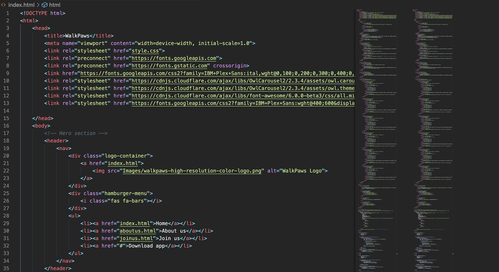
Code View
Live Design
Building a promotional website to showcase the app concept using HTML, CSS, and JavaScript
View Live Website
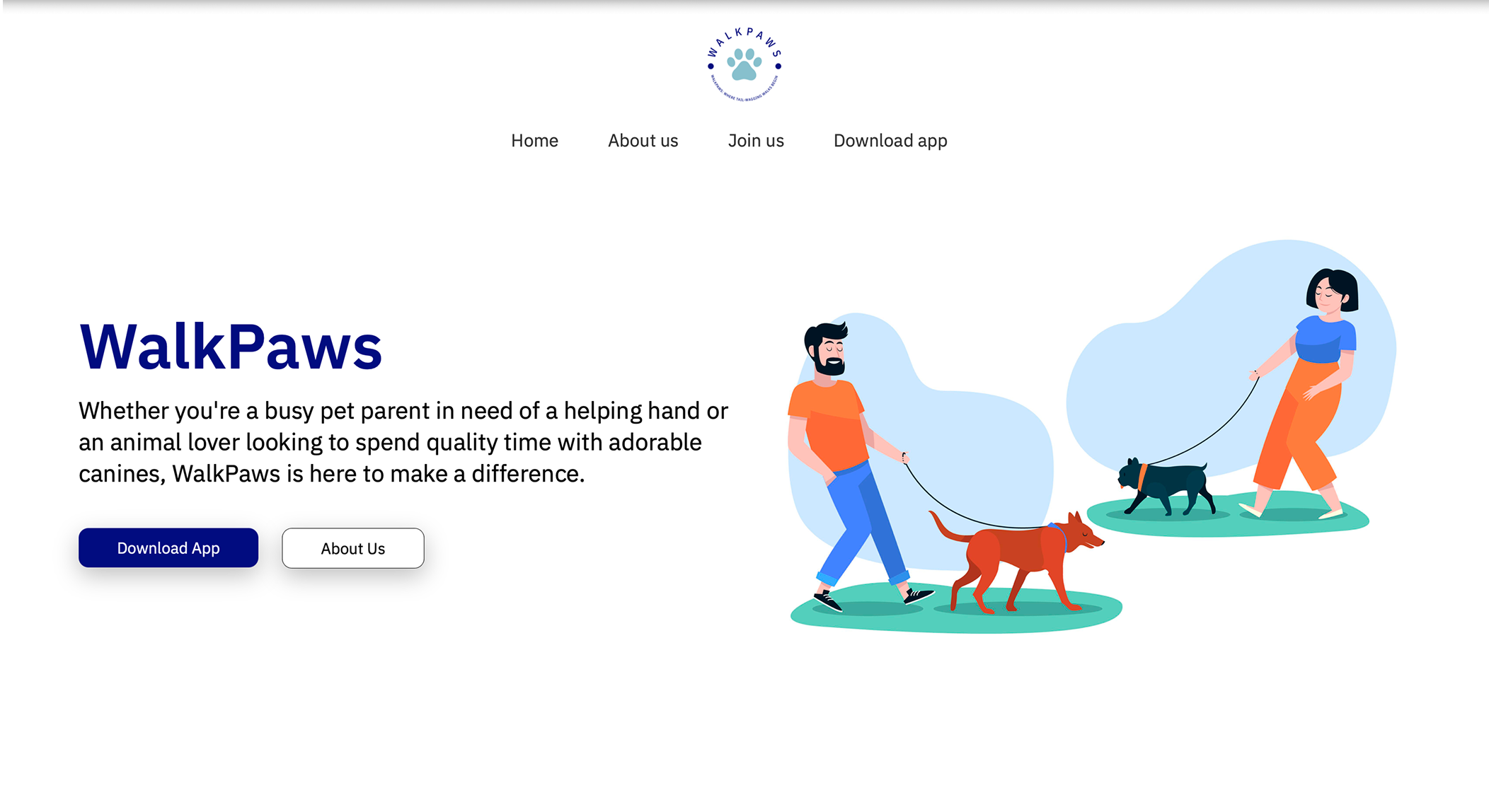
I built a promotional website for the Walk Paws app using HTML, CSS, and JavaScript. The goal was to present the app concept effectively: showcase the design, explain key features, and make it work smoothly across all devices.
The challenge was building a promotional website that effectively presents the app concept. I needed to showcase the design, explain key features, and make it work smoothly across all devices.
Organized HTML, CSS, and JavaScript files with proper folders for images and fonts.
Implemented responsive menu with smooth scrolling and active state management for intuitive user navigation across all pages.
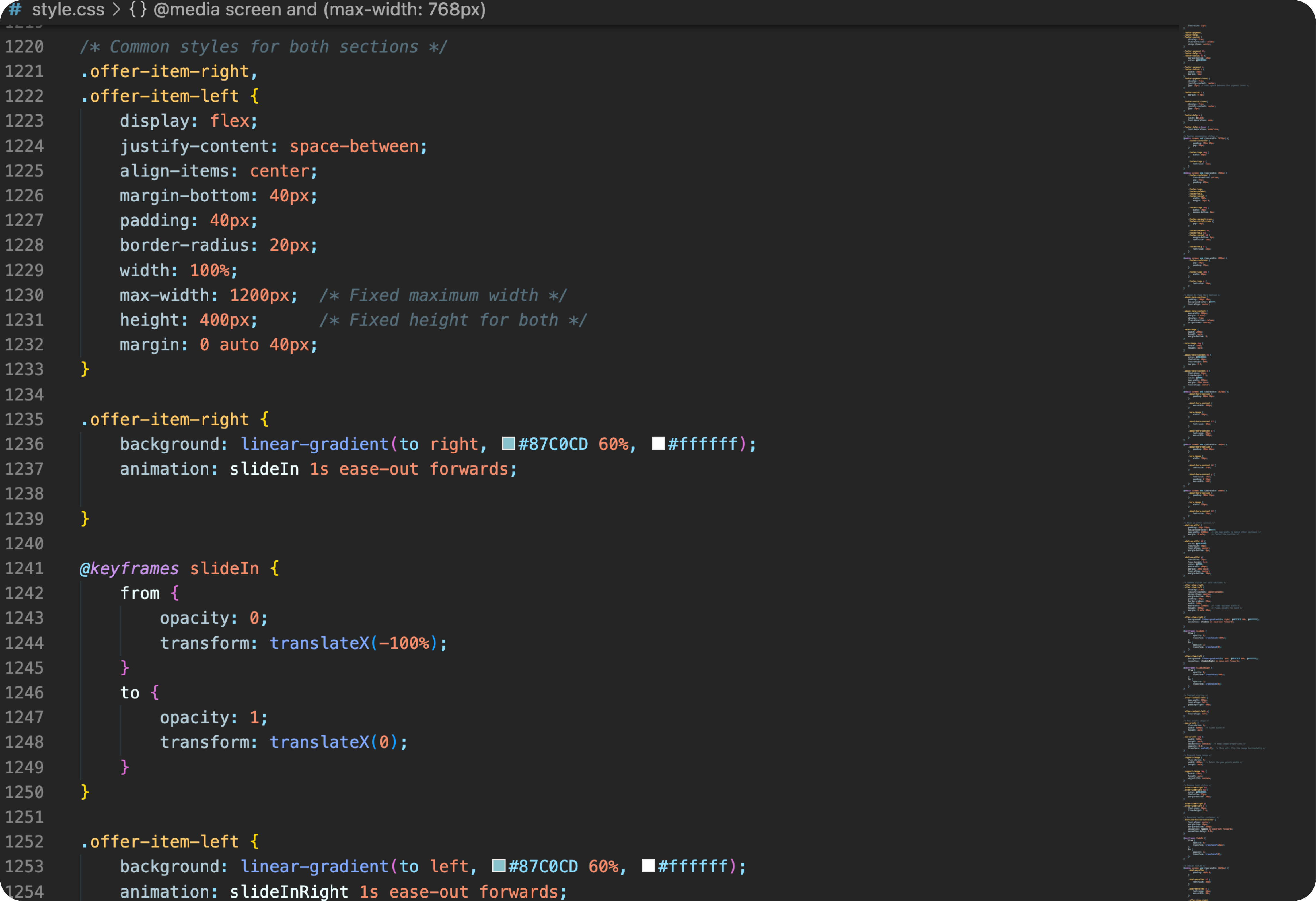
Defined strategic breakpoints and layout adjustments to ensure seamless adaptation from desktop to tablet to mobile devices.
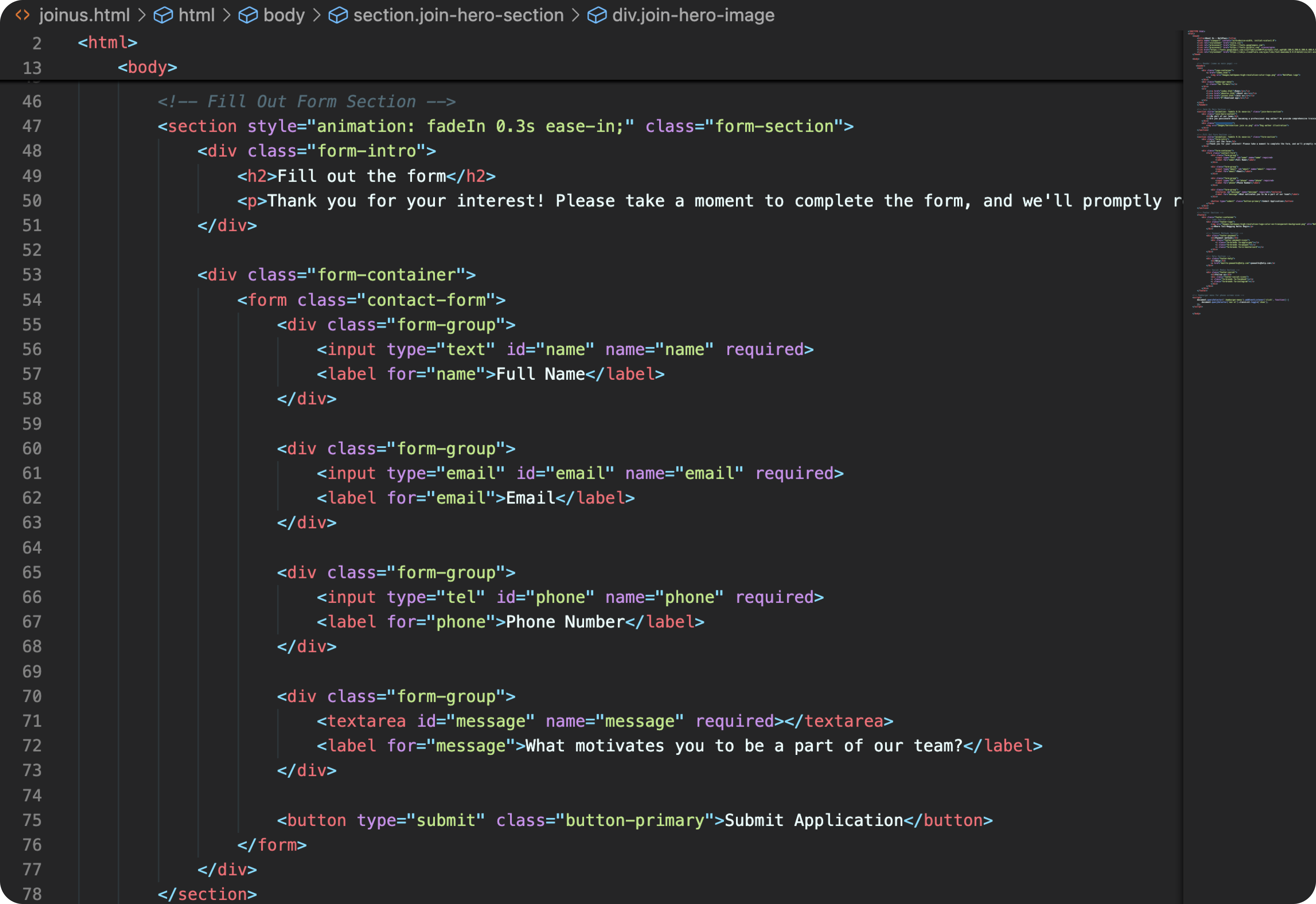
I used semantic HTML5 elements like <header>, <nav>, <main>, <section>, and <footer> to structure the code properly.
Structured, accessible HTML using semantic elements for improved SEO and accessibility
I developed a desktop-first CSS architecture with media queries for responsive adaptation across devices. The styling system includes CSS custom properties for maintainable theming, flexbox and grid layouts for modern responsive design, and carefully defined breakpoints to ensure seamless transitions between device sizes.
Modern CSS with custom properties, flexbox, and grid layouts for responsive design
I added interactive features using JavaScript: mobile menu toggle, smooth scrolling, and form validation.
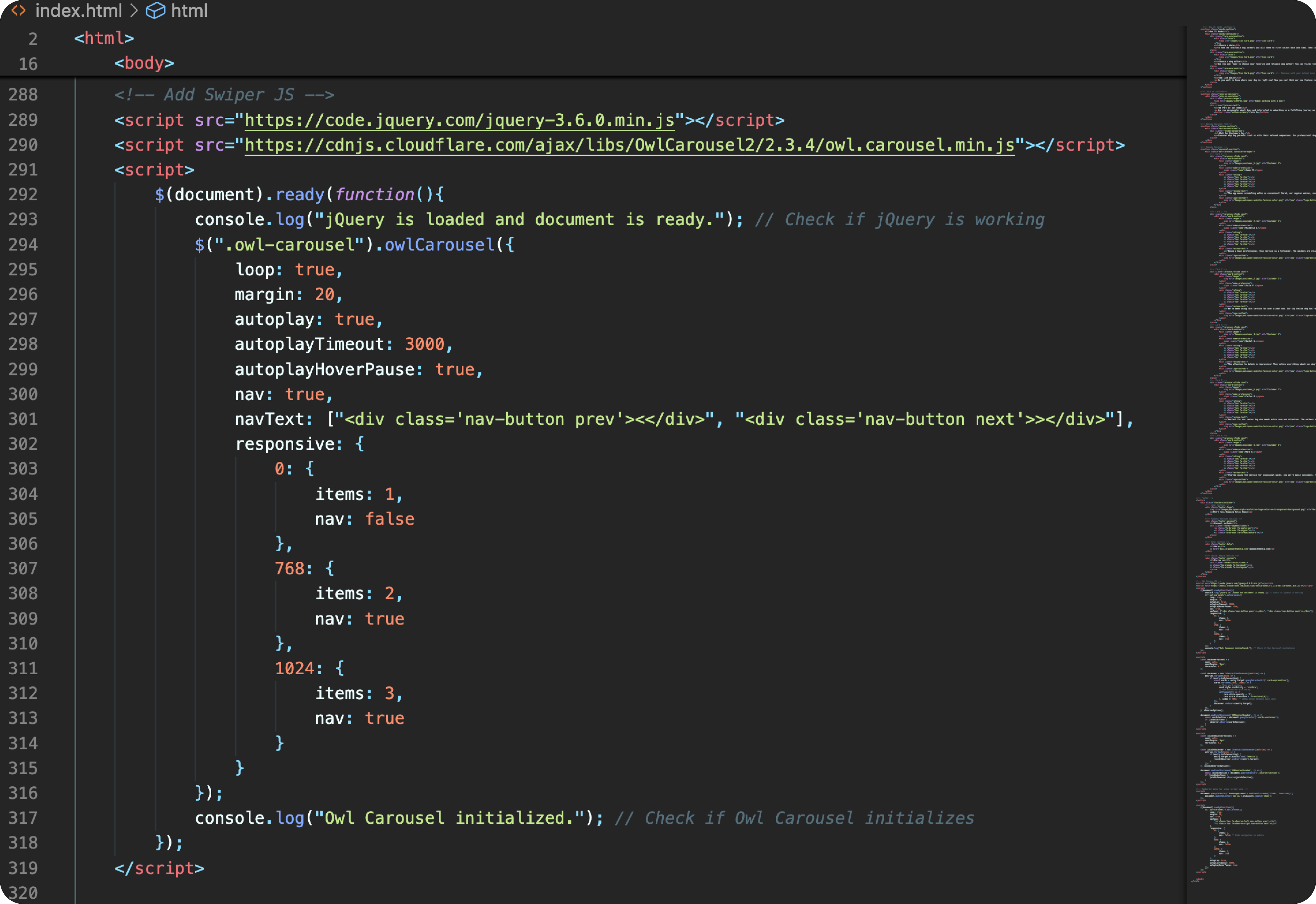
JavaScript implementation of interactive carousel with smooth transitions and touch support
I used CSS media queries to make the site work on all screen sizes—desktop, tablet, and mobile.
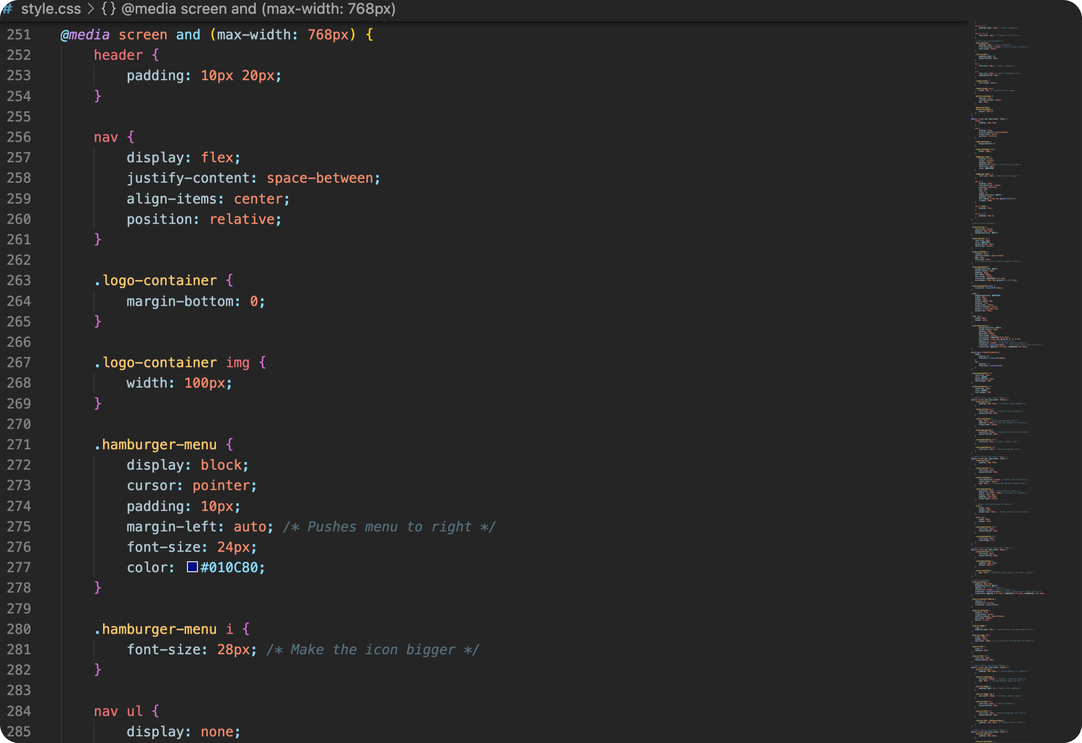
Responsive navigation pattern optimized for mobile devices with smooth animations